DETAILS OF SOME COMPANIES IN INDIA
created by:@lb!n Mathew
Bangalore; When we think about Apple company, the very first image that comes into our mind is Apple logo . It's always the logos which we remember for a long time . They have strange potential to attract customers and stay in their mind forever. They promote instant public recognitions and convey several things.
They resemble brand of the company and also reflect the innovative strength of the company. Business leaders always make sure that their logos stand for what they are. In a way logos are synonym to trademark or brand henceforth companies put lot of effort in bringing them. There will be lot of transformations in any company's history interestingly image of the logos also keep changing over a time. Then, you must be excited to know the evolution of logos of popular companies.
1. Apple
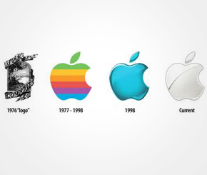
Steve Jobs, Steve Wozniak, and Ronald Wayne had together setup Apple in 1976, to sell their hand-built computer Apple I. When Apple was started, the logo was a complicated picture of Isaac Newton sitting under a tree. After hiring Rob Janoff, he created the 'Rainbow Apple' which was the logo for company till 1998. When Apple launched the new iMac in 1998, they changed their logo to a monochromatic apple logo. Now, the Apple logo comes with gradient chrome silver design.
2. Microsoft

The Microsoft story began in 1975, when Bill Gates and his friend Paul Allen coded the first computer language for a PC and named it BASIC. Soon they named their partnership as Micro-Soft which explains the first logo of the company. They changed the logo in that year itself and dropped the hyphen too. For the next 12 years, the logo had a distinctive O.
A new logo came on in 1987.The new logo designed by Scott Baker, came to be known as 'the Pacman logo' because of the distinctive cut in the O. In 1994, they integrated their tagline 'Where do you want to go today?' within the logo. The new 2008 logo has all the text in Italics but the look of the logo has remained pretty much the same.
3.Nike

Caroline Davidson designed the Nike logo for just $35 in 1971. The main part of the logo didn't change over a time. As the brand gained recognition, the company name was dropped from the logo. The company has different variations of this logo for its various departments.
4.Wal-Mart

The company has tried out various colours and variation of the word Walmart over the years. In 1962, when Sam Walton started, the company logo had simply the word spelled in a very basic design. The logo was changed in 1964, when a hyphen was added and the color was also changed from blue to black. The font of the current logo differs a little from the original and become more stylish, but the 'Walmart' word without a break appears for the first time after 1962. They keep the star from 1992.
5.Pepsi
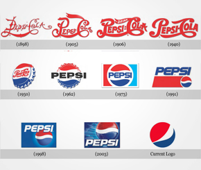
In the early years, Brad made custom logos for the brand as it became more famous. Walter Mack, then CEO of Pepsi, came up with the idea of a new bottle design, with a crown having the Pepsi logo. The 'Pepsi Globe' emerged when USA was in WWII to support the country's war efforts. Pepsi had a blue, red and white logo at that time. During the 1960s, the script was changed from the curly red and the main attraction was on the bottle cap in the logo. We see the first appearance of the Pepsi Globe instead of the bottle cap in 1973. The globe now had 3D graphic and larger than earlier versions.The globe came on top of the script in 2003.
6.Google
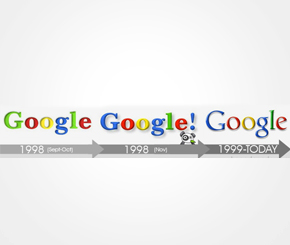
Google's first logo was created by Brin, after he taught himself to use the free graphic software GIMP. Later, an exclamation mark mimicking the Yahoo! logo was added. In 1999, Stanford's Consultant Art Professor Ruth Kedar designed the Google logo that we find today.
7.IBM
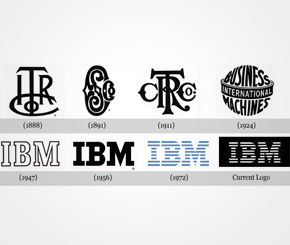
IBM was earlier known as The International Time Recording Company (ITR), whose major products were mechanical time recorders, invented and patented by Willard L. Bundy in 1888. The old logo of the company had ITR inscribed on it. In 1947, IBM decided to bring lot of changes. The logo was not the only change in 1947,it was accompanied by a change in business from the punched-card tabulating business to computers.
Tom Watson, Junior decided to project the beginning of a new era in the company, for that he changed the company's logo as well as the actions. Paul Rand designed the new logo which represented that the changes in the company would be subtle and will not disrupt the continuity. Also, the new logo looked more solid, grounded and balanced. Another change in the logo was designed by Paul Rand which had stripes instead of the solid font. It depicted 'speed and dynamism' of the company.
8.Kodak
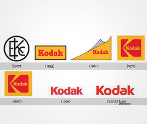
Kodak was the first company to integrate its name and looks into one symbol in 1907. First time the Kodak name was completely written in the logo in 1935. In 1960, they tried to show a flip page as a logo, but were changed to a box and graphic 'K' element in 1971. Again, like other companies, Kodak decided to simplify their logo in 1996 and removed the boxes.
others
created by:@lb!n Mathew
Bangalore; When we think about Apple company, the very first image that comes into our mind is Apple logo . It's always the logos which we remember for a long time . They have strange potential to attract customers and stay in their mind forever. They promote instant public recognitions and convey several things.
They resemble brand of the company and also reflect the innovative strength of the company. Business leaders always make sure that their logos stand for what they are. In a way logos are synonym to trademark or brand henceforth companies put lot of effort in bringing them. There will be lot of transformations in any company's history interestingly image of the logos also keep changing over a time. Then, you must be excited to know the evolution of logos of popular companies.
1. Apple
Steve Jobs, Steve Wozniak, and Ronald Wayne had together setup Apple in 1976, to sell their hand-built computer Apple I. When Apple was started, the logo was a complicated picture of Isaac Newton sitting under a tree. After hiring Rob Janoff, he created the 'Rainbow Apple' which was the logo for company till 1998. When Apple launched the new iMac in 1998, they changed their logo to a monochromatic apple logo. Now, the Apple logo comes with gradient chrome silver design.
2. Microsoft
The Microsoft story began in 1975, when Bill Gates and his friend Paul Allen coded the first computer language for a PC and named it BASIC. Soon they named their partnership as Micro-Soft which explains the first logo of the company. They changed the logo in that year itself and dropped the hyphen too. For the next 12 years, the logo had a distinctive O.
A new logo came on in 1987.The new logo designed by Scott Baker, came to be known as 'the Pacman logo' because of the distinctive cut in the O. In 1994, they integrated their tagline 'Where do you want to go today?' within the logo. The new 2008 logo has all the text in Italics but the look of the logo has remained pretty much the same.
3.Nike
Caroline Davidson designed the Nike logo for just $35 in 1971. The main part of the logo didn't change over a time. As the brand gained recognition, the company name was dropped from the logo. The company has different variations of this logo for its various departments.
4.Wal-Mart
The company has tried out various colours and variation of the word Walmart over the years. In 1962, when Sam Walton started, the company logo had simply the word spelled in a very basic design. The logo was changed in 1964, when a hyphen was added and the color was also changed from blue to black. The font of the current logo differs a little from the original and become more stylish, but the 'Walmart' word without a break appears for the first time after 1962. They keep the star from 1992.
5.Pepsi
In the early years, Brad made custom logos for the brand as it became more famous. Walter Mack, then CEO of Pepsi, came up with the idea of a new bottle design, with a crown having the Pepsi logo. The 'Pepsi Globe' emerged when USA was in WWII to support the country's war efforts. Pepsi had a blue, red and white logo at that time. During the 1960s, the script was changed from the curly red and the main attraction was on the bottle cap in the logo. We see the first appearance of the Pepsi Globe instead of the bottle cap in 1973. The globe now had 3D graphic and larger than earlier versions.The globe came on top of the script in 2003.
6.Google
Google's first logo was created by Brin, after he taught himself to use the free graphic software GIMP. Later, an exclamation mark mimicking the Yahoo! logo was added. In 1999, Stanford's Consultant Art Professor Ruth Kedar designed the Google logo that we find today.
7.IBM
IBM was earlier known as The International Time Recording Company (ITR), whose major products were mechanical time recorders, invented and patented by Willard L. Bundy in 1888. The old logo of the company had ITR inscribed on it. In 1947, IBM decided to bring lot of changes. The logo was not the only change in 1947,it was accompanied by a change in business from the punched-card tabulating business to computers.
Tom Watson, Junior decided to project the beginning of a new era in the company, for that he changed the company's logo as well as the actions. Paul Rand designed the new logo which represented that the changes in the company would be subtle and will not disrupt the continuity. Also, the new logo looked more solid, grounded and balanced. Another change in the logo was designed by Paul Rand which had stripes instead of the solid font. It depicted 'speed and dynamism' of the company.
8.Kodak
Kodak was the first company to integrate its name and looks into one symbol in 1907. First time the Kodak name was completely written in the logo in 1935. In 1960, they tried to show a flip page as a logo, but were changed to a box and graphic 'K' element in 1971. Again, like other companies, Kodak decided to simplify their logo in 1996 and removed the boxes.
others
1) Tata Group
19 Feb, 2013
2011 rank: 20 :According to the company's website, the Tata group comprises over 100
operating companies in seven business sectors: communications and
information technology, and engineering among others.
2) Maruti Suzuki-19 Feb, 2013
2011 rank: 4 :Maruti Suzuki India is the country's largest passenger vehicles
manufacturer. The company has manufacturing plants in Manesar and
Gurgaon.
3)Delhi Metro Rail Corporation
19 Feb, 2013
2011 rank: NA :Renowned for making commuting easier in the national capital, Delhi
Metro Rail Corporation has found entry into the list this year. Delhi
Metro is a trendsetter for other cities of the country.
4) State Bank of India
19 Feb, 2013
2011 rank: 7 :State Bank of India (SBI) is the country's largest public sector bank.
It is headquartered in Mumbai. Pratip Chaudhuri is currently the
chairman of the bank.
5)LIC India
19 Feb, 2013
2011 rank: 12 :Life Insurance Corporation of India (LIC) is a dominant state-owned
life insurer even in the liberalized scenario of Indian insurance.
6)Infosys Tech
19 Feb, 2013
2011 rank: 1 :Country's second largest software services firm Infosys was founded in
1981. Often, Infosys watchers like to look back at the go-go times when
NR Narayana Murthy and Nandan Nilekani led the IT behemoth. Currently
led by SD Shibulal, Infy now is an altogether different beast with 776
active clients, more than a-lakh-and-a-half employees, a much more
complex service offering.
7)Facebook
19 Feb, 2013
2011 rank: 8 :Facebook is a social networking service launched in February 2004.
Co-founded by Mark Zuckerberg, Facebook went public with its IPO in
2012.
8)Mahindra Group
19 Feb, 2013
2011 rank: 10 :Led by Anand Mahindra, the Mahindra Group's operations span around 17 key industries. The group was founded in 1945.
reference : http://economictimes.indiatimes.com/slideshows/corporate-industry/most-successful-and-influential-companies-in-india/top-10-most-successful-and-influential-companies-in-india/slideshow/18572627.cms
~~~~~~~~~~~~~~~~~~~~~~~~~~~~~~~~~~~~~~~~~~~~~~~~~~~~~~~~~~~~~~~~~~~~~~~~

No comments:
Post a Comment